Proposal for an Improved EMU WEB GRID
|
|
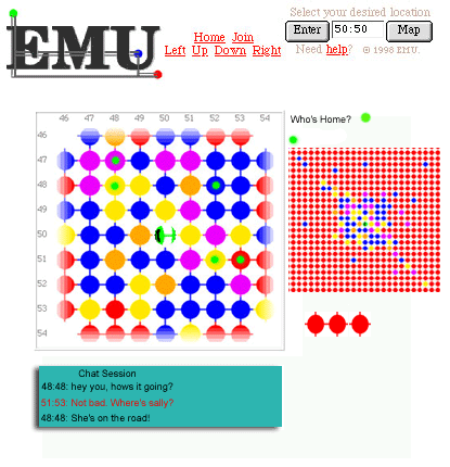
Based
on recommendations of actual users, colleagues and others this imaginary screen
grab from a future EMU WEB GRID shows some additions which might improve the
site.
Included
is a chat area, with EMUWEB GRID participants indicating they are available for
chat by turning on a green marker. Accompanying this would be a pop-up menu of
those sites whose owners are 'home'. Also a zoomed out view of the city would
appear alongside the main view, enabling users to more quickly visually select
a region. The zoom function would be scalable so that you could navigate to
your region or that of someone you are visiting quickly.
The
idea of grouping sites by association is echoed partly in Digital Cities
Amsterdam's. That web city's original design represented people's 'homes' by
means of polygonal jigsaw puzzle like quadrants which were linked by
association of theme or service provided. For example health and safety topics
were grouped near sex and drug related topics. Within those, quadrants were
further detailed.
Enabling
the grouping of dots according to theme based criteria, for the purposes of
seeing 'all the people in EMU interested in skateboards' for example would
provide a totally different way of making use of the grid system.
One method for doing this would be to offer a range of ways for users to appear grouped. "Sub-cities" could be invoked by choosing sites based on theme, or chat topic, and so on. This 'state of origin' (a game where the players share a common geographic origin) approach to displaying the dots would render the numerical grid system one starts with temporarily redundant. Instead, letters of the alphabet would indicate one's relative position to associated dots and their owners. A new model of adjacency would occur in which your dot would appear within a cluster of other dots based not on the original spatial arrangement - dictated by availability and accident, rather by an index of similarity of view, or preference for discussion.
