
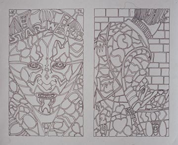
 Two mosaic Compositions | 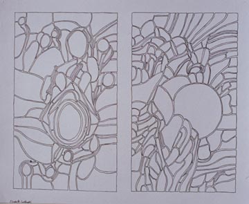 Two mosaic Compositionsby: Jill Waffner |
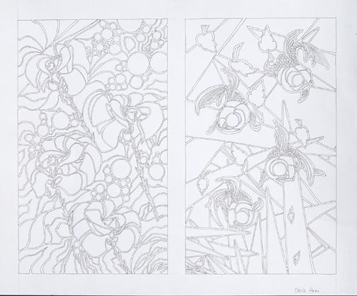 Two mosaic Compositionsby: Chris Hom | 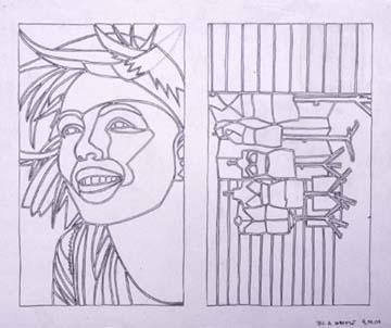 Two mosaic Compositions |
PATTERN
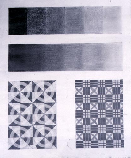 Gray scale pattern designby: | 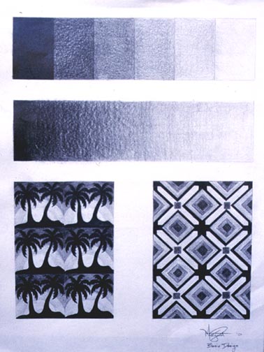 Overlapping planes |
 Gray scale pattern design |
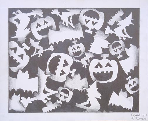 Overlapping planesby: Fiona Ho | 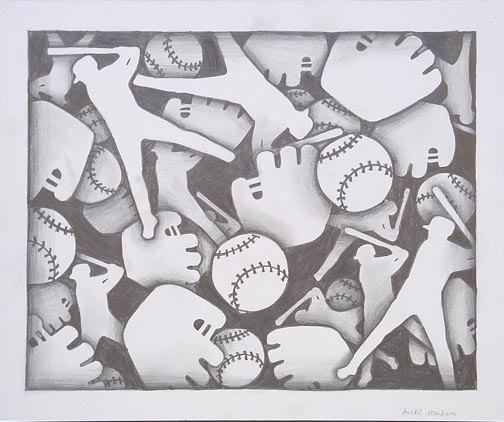 Overlapping planesby: Miki Asukura |
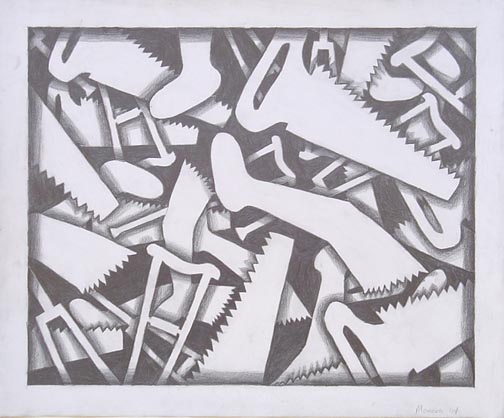 Overlapping planesby: Sam Manera | 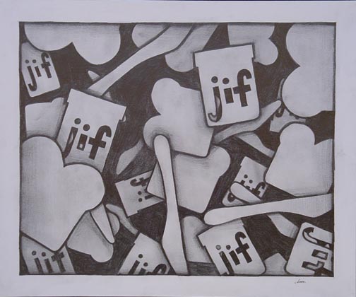 Overlapping planes |
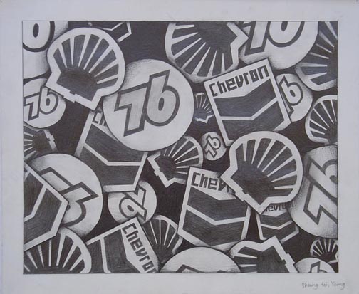 Overlapping planesby: Po Ying Leung | 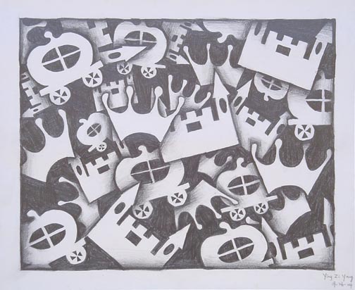 Overlapping planesby: Ying Yan |
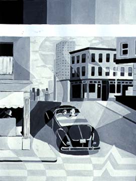 Gray Scale ExerciseBy: Margaret Belch | 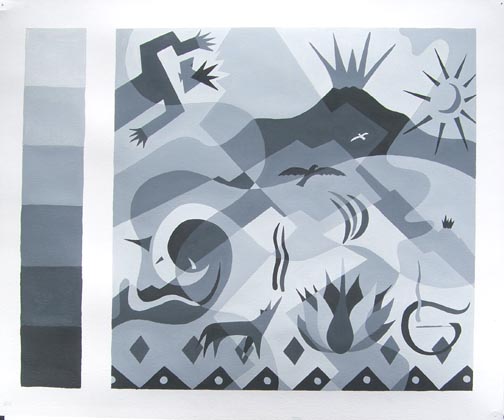 Gray Scale ExerciseBy: Tom Indermaur |
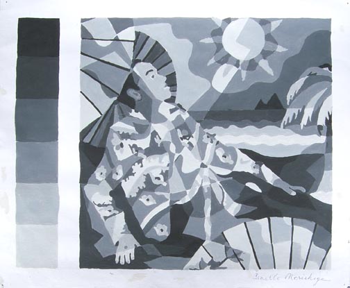 Gray ScaleCamille Morishige |
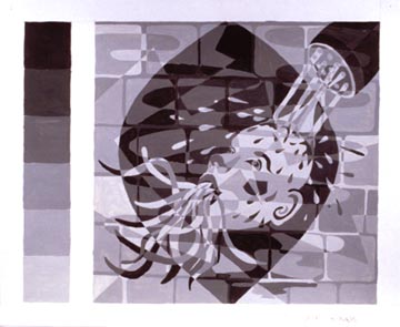 Gray Scale ExerciseBy: Saori Kimura | 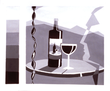 Gray ScalePaul Gorman | 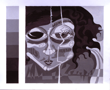 Gray Scale ExerciseElena Delgado |
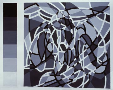 Gray Scale Composition | 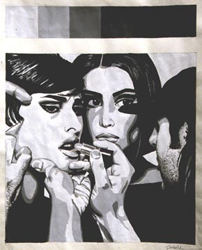 Gray Scale CompositionBy: Isabelle Ospital | 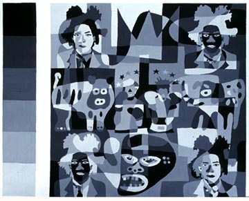 Gray Scale Composition |
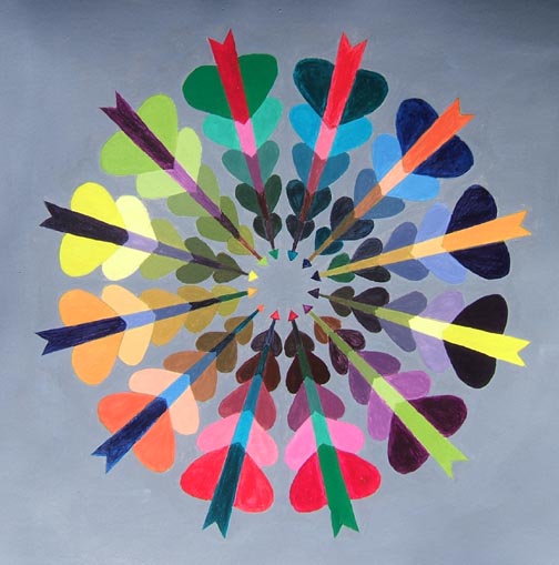 Color Wheel Exerciseby: Andres Chavez |
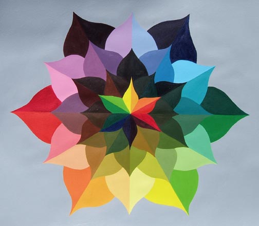 Color Wheel Exerciseby: Jeffrey Hewitt | 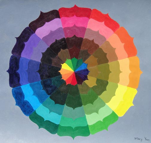 Color Wheel Exerciseby: Mary Yun |
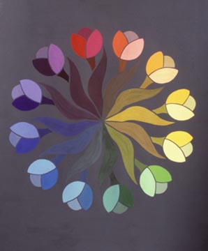 Color Wheel Exerciseby: Debbie Yu | 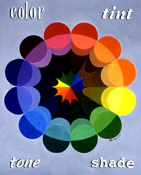 Color Wheel Exerciseby: Margaret Belch |
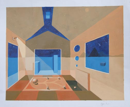 Tile Design Projectby:Yang Lu |
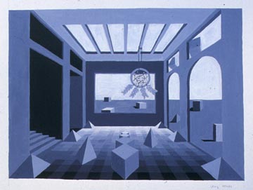 Monochromatic perspective | 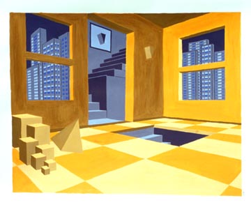 Monochromatic perspectiveby: Nilu Zargham |
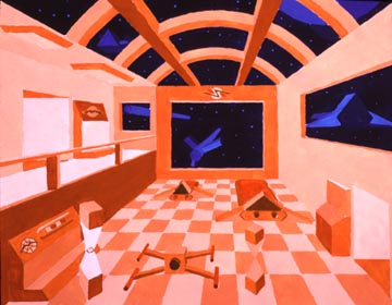 Monochromatic perspective | 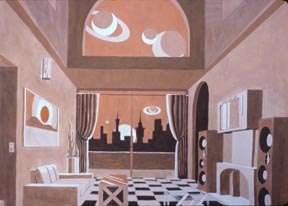 Perspective Space and Monochromatic Project |
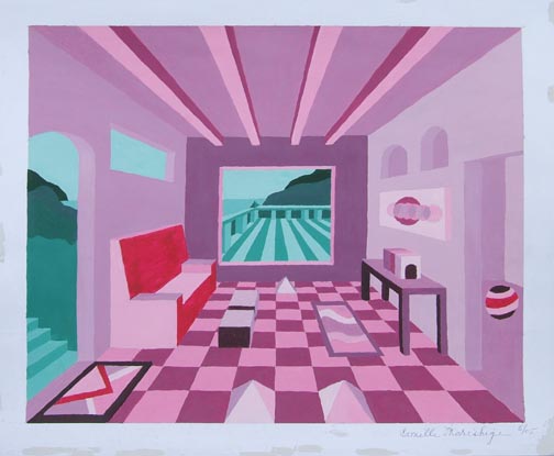 Monochromatic perspectiveby:Camille Morishige | 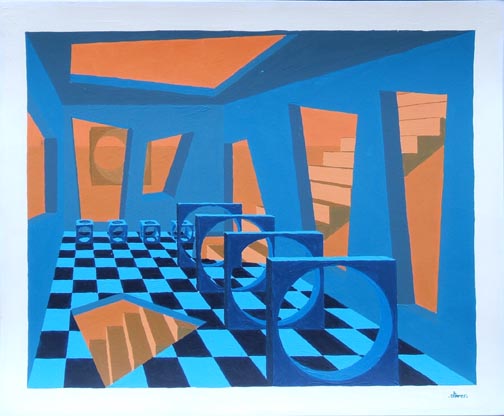 Perspective Space and Monochromatic Projectby:Oliver Paradie |
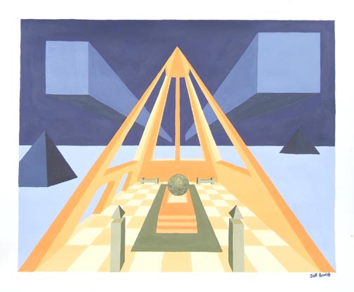 Monochromatic perspectiveby: Jeffrey Hewitt | 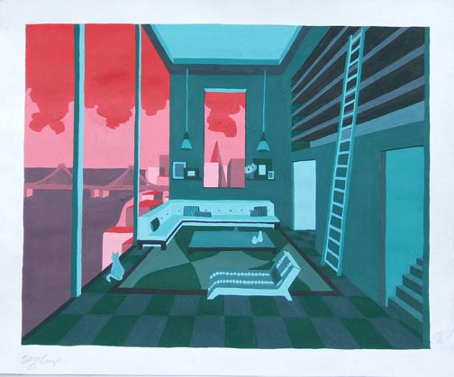 Perspective Space and Monochromatic Projectby: Sara Camp |
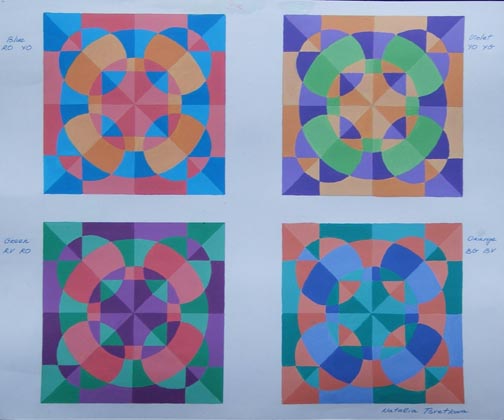 Tile Design Projectby:Tatiana Tsevetkova | 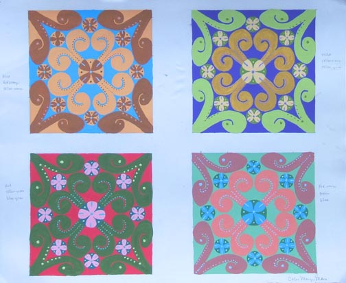 Tile Design Projectby: Cecile Mongemana |  Split Complement tile designBy: Ami Inose |
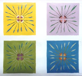 Tile Design Project | 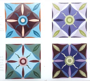 Tile Design Project |
Updated January 14, 2004
FINE AND APPLIED ART APPLICATIONS:
Usually most suited for: Drawing, painting, Printmaking, Photography, Architectural design, Visual Communication and Multi Media.
SUBJECT FORM AND CONTENT:
SOME OVERALL SIGNIFICANT APPLICATIONS OF DESIGN ARE:
PLANNING:
THE GEOMETRY:
PROCESSES OF TWO-DIMENSIONAL DESIGN:
Problem solving and ideation techniques. All take place through the process of concept, plan and execution. Any presentation of form that is signified by height and width. Orthographic projection and planning Painting (all forms) Drawing (all forms) Inks Mixed Media Print technologies
FORM AND FUNCTION:
Tools:
COMPOSITION:
Basic design takes place on a two-dimensional surface and the picture edge or the margin defines that surface. This space within the margin is called "composition space". The elements of design and the Principles of organization are used to create the finished result called the composition. The result of organizing all of the elements of a work of fine or applied art into a harmoniously unified whole. Each element used may have characteristics that create interest, but must function in a way that the whole is more important than the sum of its parts. The make up of a picture which can involve one, all or some of the elements of design and one, some or all of the organizing principles of design creates the composition of a picture. This can also be known as the content of a picture.
SPACE:
This is characterized as boundless or unlimited extension in all directions with an option to contain or not to contain mass. Art orientation uses the term to describe the interval or measurable distance between pre-established points. An area such as a blank page which can be drawn upon, or an open field, room, or area which can be manipulated. Space can be further affected by one, two, and three-point perspective. It is the area to be affected by the elements and principles of organization in design.
Boundless or unlimited extension in all directions; void of matter. Used to describe the interval or measurable distance between pre-established points. An area, in which design or drawing can be arranged, worked or placed within.
SPACIAL ORGANIZATION:
OTHER OPTIONS OF SPACE IN DESIGN
THE PICTURE PLANE AND FORMAT:
Basic design takes place on a two-dimensional surface and the picture edge or the margin defines that surface. This space within the margin is called "composition space". The configuration of the space within the Picture plane as defined by frames, borders or limitations that represent the "Format." The surface can be:
FORMAT:
DEGREES OF REPRESENTATION:
THE TWO DIMENSIONAL DESIGN ELEMENTS
DOT:
The initial and minimal contact with the working surface to affect two dimensional space. Point, mark, spot, emphasis, speck, foundation, position, isolation, place, start. A unit which can call attention to a target or act as a guide. The indication or impression. placement, focal point, minimum effect, mark, stipple. The point or mark as the minimum effect or description on the picture plane.
LINE:
The path of a moving point such as a mark made by a tool or instrument as it is drawn or dragged across a surface. It is usually made visible by the fact that it contrasts with the surface upon which it is drawn. Foundation, description, edge, divide, quality. Different types: Diagramatic, structural, calligraphic, delineating, density, direction, color, dashed, dotted, an organizer, the foundation. The most flexible lines for making shape are curved, bent, or straight. A visual element used to divide and to organize space.
SHAPE/FORM:
An area that stands out from the space next to or around it because of a defined boundary or a difference in value, color, or texture. Form is the three-dimensional description of shape as mass or bulk in space. Can also be described as outline. Outline and mass using line or value, geometric, biomorphic positive/negative, naturalistic, abstract, varieties, organic, ambiguous, color, silhouette. Any element that can be used to give or determine form. An enclosed area of space where line has begun at an edge or point and ends at an edge or point.
Some other options for understanding shape are:
VALUE:
The relative degree of lightness or darkness distributed or applied to an area by the amount of light reflected from it. A gradual or step by step difference of light to dark in shading through any visual recording media. Black, grays, and white. Light to dark scale. Full strength or diluted, high contrast. The relative degree of lightness and darkness.
TEXTURE/PATTERN:
The surface feel of an object or the representation of surface character. Texture is the tactile (physical) and visual (mental) feel of surface area as it is arranged and altered by nature. Pattern can appear as texture though it is better understood as a predictable representation of a visible idea through rhythm or repetition. The three best known kinds of texture are; actual, simulated, and invented. Actual is actual. Simulated is the imitation of real or actual. Invented or decorative textures do not imitate textures of real life. The artist invents them. The surface character of a material that can be experienced through touch or the illusion of touch (such as vision).
COLOR:
The character of a surface that is the result of the response of vision to the wavelength of light reflected from that surface. Color can be used with all of the above and adds the quality of emotion as well as other variables derived from the electromagnetic spectrum. The scientific and theoretical practice of hue, value, and chroma as well as the relationships and characteristics. Involves physics (illumination), chemistry (pigmentation), Physiology (the eye), and psychology (perception/interpretation). Warm and cool, Neuropsychological, color mixing, theory. Perception, dynamics, functions, identity, expression, local, optical, arbitrary. The visible area of the electromagnetic spectrum.
TIME:
6 ELEMENTS OF TIME
THE DESIGN PRINCIPLES OF ORGANIZATION
*Unity/Harmony:
Implies congruity or agreement among the elements in design. They look as if they belong together. There is some visual connection. If not harmonious, they look as if they are separate or unrelated. The organization of the elements into a unified pattern. They can include proximity, repetition, continuation, and unity with variety. *Unity :The term is sometimes listed as one of the organizing principles of design, but in this book it is used to connote the combined result of all principles of design (repetition, variety, rhythm, balance, emphasis, economy, and proportion).
Repetition:
Elements that insinuate eye movement or non-still images. They include memory images that can be many figures in stop action. There is figure or shape repetition. Fuzzy outline or many lines overlapped which make shapes such as multiple images. Optical movement or "op-art".
Variety:
As with any of the above especially when all or many of them can be used. The quality of variation which creates a natural opposite of sameness within a composition. The spacing of pictorial space with visual seasoning or a blend of visual texture.
Rhythm:
A principle we associate with hearing as well as movement. The movement of the viewers eye. Any visual pattern which causes the eye to move quickly and smoothly from one element to another. Based upon repetition. Involves a clear repetition of elements that are the same if only slightly modified. Can also include repetition, alternating rhythm and progressing rhythm that means a repetition of a shape that changes in a regular manner.
Balance:
An innate need for a sense of balance. Unbalanced is disturbing. Leaning elements are uncomfortable generally. Equilibrium is needed. Equal distribution of visual weight. It does not mean that there is no need for imbalance. This can include symmetry or asymmetry, color, value, shape, texture, position, eye direction, radial balance, all over pattern.
Emphasis/Focal Point/Dominance:
Avoid boredom and attract attention. Applies to objective or non-objective images. Avoid too many. With many elements the same size, a larger one will seem more important. Recognition also adds to importance. They can include emphasis by contrast, isolation, placement, and degree of emphasis and absence of a focal point.
Economy:
Yet another way of creating emphasis is to limit the viewer's focus to only a few elements of design. This device is called visual economy--stripping away all nonessentials to reveal the essence of a visual idea. This esthetic eliminates clutter, allowing the mind to focus on the beauty of the seemingly simple.
Proportion/Scale:
Size versus relative size. The scale of the art with respect to the size of the work. The scale within the work relative to the overall area of the format. It can be observed as big in one format yet small in another. Scale confusion that is a deliberate change to intrigue or mystify as in surrealism. The human figure as a measure or nearly all things. The golden mean.
Click here to return to home page.