After using any source to familiarize yourself with Chart tools, create the two custom charts shown in the excel file contained in the zipped folder. The zipped folder also contain some images for you to use, but you can use any appropriate images you wish.
Below are some brief instructions and screen captures of dialog boxes that you may not have discovered. The screen captures are for 2013 and differ slightly form 2010, but the steps are exactly the same.
We are creating a custom chart to show expenses at Christmas time. We want to substitute an image for the usual columns that appear in the standard chart.

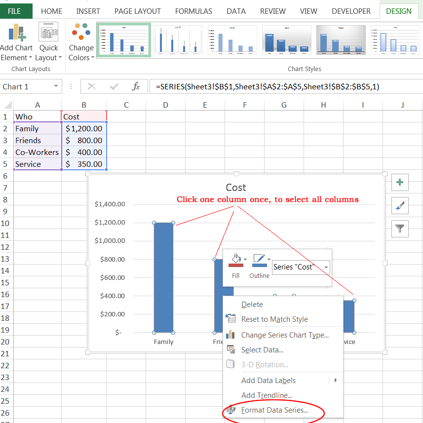
After selecting the labels and values to chart, click to select the column (the data series). Be sure ALL columns are selected. Right-click and choose Format Data Series.

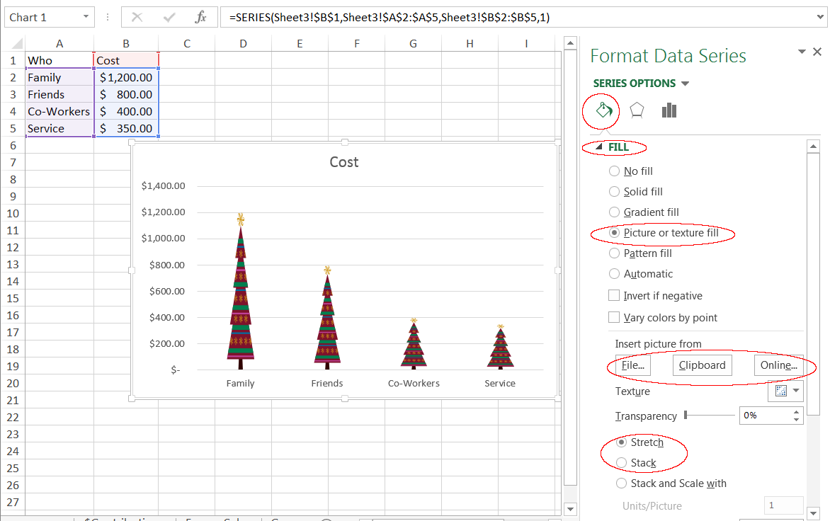
From the panel onthe right, select the Fill icon.
Expand the options by clicking the word Fill.
Select Picture.
Choose where your picture can be found. In this example, I used Online, and searched Christmas tree.
After inserting, test the difference between Stretch and Stack.
You can continue to customize any part of the chart by clicking it and exploring all the options in the panel on the right.
When clicking around on the chart, be sure to note the difference bewtween chart area and plot area. Below is an image applied to the Chart area.
Bread Sales Chart
Pie Sales Chart
Zipped folder of images, and Excel file with instructions and data, for the two custom charts.
Upload file for grading.