
Week 5, Friday
More Excel
Tracey Kobayashi
50 Phelan Ave, NGYM
San Francisco, CA 94112
(415)452-7311
tkobayas@ccsf.edu
PE 9A: Fit or Fat
College & Career Ed
PE 50: Fitness Center

IM Me!
AIM - TKatCCSF
Yahoo - tkobico
ICQ - 155909399
Today, I would like you to create an Excel chart on your own. But first, let's review charts in general.
Series
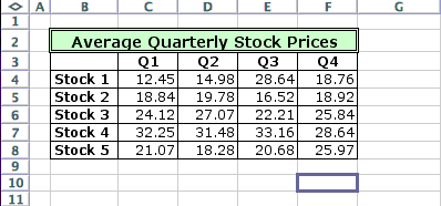
One of the concepts we've had more trouble with in our charting is that of the Series. One of the definitions of Series is: a number of similar or related things coming one after another. In the case of the charts we have created, this usually refers to things like change in prices or income through different time periods. In the example below, each Row represents a series of prices for a particular stock.
In a chart, a Series is represented by a line or color. In a line graph, you would want each series to run across the chart. From out data above, we would tell Excel our series are in rows, and end up with a chart like the following:
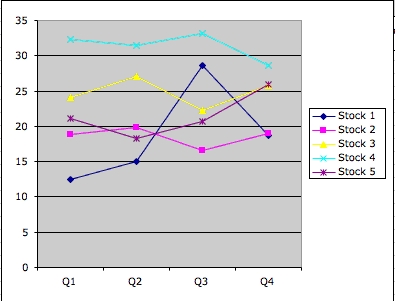
We can see that the graph shows our stock prices over 4 quarters. If we told Excel our series were in columns, our chart would like like:
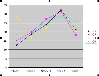
This chart is a little more difficult to read. Since the price for each stock is stacked, it's difficult to discern how the price changed over time. You can see that the prices were at specific points at some point, but you have to keep referring to the legend to tell which price came when.
The Assignment
Open your Workbook for Madonna's Catering (its name should be Cash Flow). Create a chart ON A NEW SHEET that displays how Madonna's transportation expenses fluctuate throughout the year. Save your workbook.
Open a new Explorer window and log in to your Yahoo! email account if you are not already logged in. Attach your Cash Flow workbook to a new email and address it to me at my Yahoo! account
tkobico@yahoo.com
Using the handouts, your notes, or most importantly, your memory, answer the following questions in the body of your email.
- Based on the sample sheet at the top of this page, you want to display the average price of Stock 1 in cell E3. What is the formula you would type into cell E3?
- How would you change the background color of the cells that contain the stock prices (B3 through E7)? Begin by telling me how you would select the proper cells. You can tell me how to do it through either the menus or toolbar (name the toolbar the function is on).
- How would you add gridlines to the same group of cells? Gridlines are the lines that separate the cells.
- You have used the Formatting Toolbar at least 3 days a week.
- What is the Formatting Toolbar?
- If your Toolbar is not viewable (you can't see it), how do you make it possible for you to view it?
- Go back to Madonna's Catering (the Cash Flow workbook).
- On which sheet would you be able to view Madonna's total income for each month?
- During which months do you think Madonna might consider lowering her prices somewhat? Why?
- During which months do you think Madonna could risk raising her prices a tad? Why?
Last, but not least, send your email to me! If you have time, please practice your Mavis. Have a good week-end!